LIGHT THAT INVITES — AND COMMUNICATES
When lighting communicates without words — and makes architecture more inviting and usable after dark
Light is often called the silent communicator. It sounds poetic, but in practice it’s a very concrete design discipline: light can define boundaries, indicate direction, create places to pause, signal accessibility — and transform a site from a “pass-through” into a “destination” — without a single sign.
We know the phenomenon from the metropolis. Paris and Manhattan are recognizable by their silhouettes, even in black and white. That recognizability doesn’t come only from building forms, but from the rhythm and contrast of light: what steps forward, what glows, and what is allowed to remain dark. Light becomes identity, legibility, and expectation in one and the same gesture.
And we know it from something quintessentially Danish: Tivoli. Here, lighting isn’t merely functional. It carries atmosphere and builds a sense of safety. It tells the body: here you can drop your shoulders, walk more slowly, stay a little longer. This is light shaping behaviour.
At Okholm Lighting, several projects have been developed with precisely this mindset: light as an integrated substance of architecture — where illumination solves functional needs, creates comfort, and simultaneously communicates something about the place. Two outdoor projects show this particularly clearly: Risbjerggård in Hvidovre and the activity space at Orientkaj in Nordhavn.
A quiet, powerful welcome
— The Risbjerggård cultural institution in Hvidovre
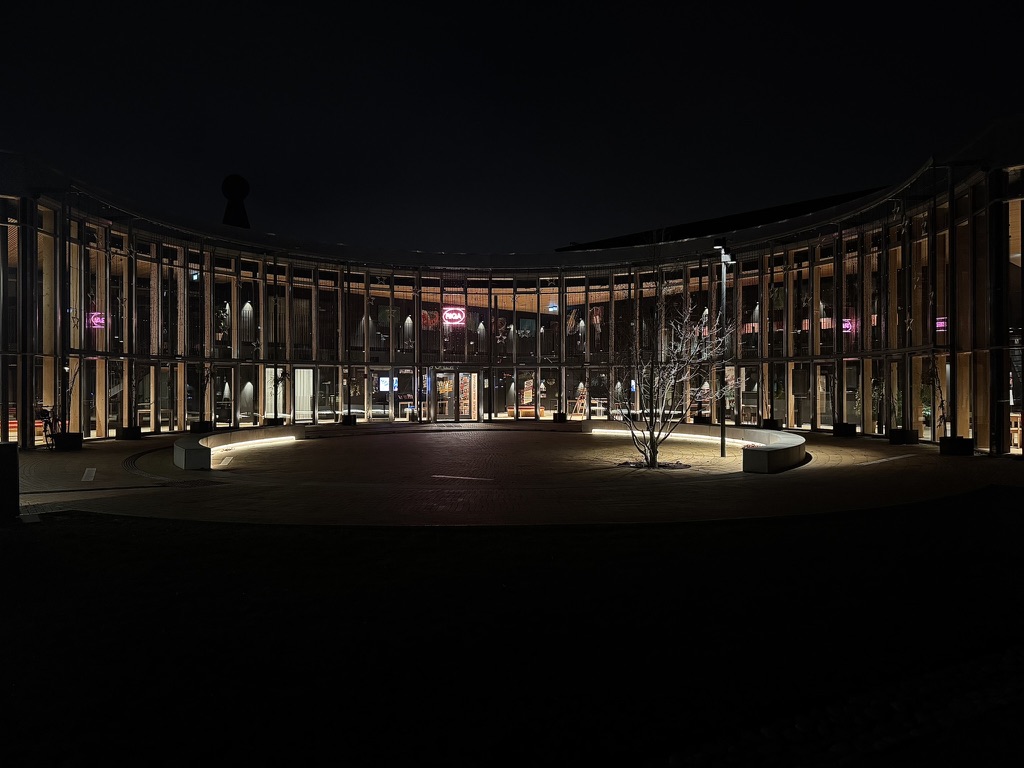
The Risbjerggård cultural institution sits in Hvidovre town centre as part of the overall plan around the city hall, designed by Vandkunsten. The ambition is clear: the site should bring together community associations and cultural offerings and inject more life into the centre. In front of the institution, a larger area is laid out as a green, undulating park landscape, and the building’s frontage is marked by a semi-circular atrium structure.
The most compelling move is the threshold between public realm and entrance. A circular forecourt is formed by two concrete “arcs”, produced by Aarhus Cementvarefabrik, which already in daylight act as a graphic and geometric invitation. As darkness falls, integrated light at the base of the concrete benches is switched on. The result is simple — but precise: the circular form becomes readable from a distance, and the entrance “emerges” as a luminous portal without shouting — quite the opposite.
Here, the light communicates three things at once:
Direction: the glowing circular geometry draws visitors toward the entrance.
Presence: the institution feels “open” and active — even after sunset.
Stay: the bench is more than furniture; it becomes an inviting installation in the outdoor room and encourages social interaction.
The plaza is lit primarily by the low-level integrated light in the benches, supplemented by an asymmetrically placed mast with multiple spot luminaires. The building’s glass façade then becomes a beautiful decorative backdrop, revealing its open timber structure. This makes the low, integrated lighting even more convincing, because it reads as part of the architecture — not as an added layer.
An invitation to linger and move
— The activity space at Orientkaj
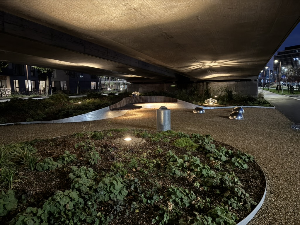
Where Risbjerggård is about arrival and gathering, Orientkaj is about making a large, raw infrastructural space human-scale and usable. Beneath the elevated metro structure at Orientkaj Metro Station in Nordhavn, By & Havn, together with the consultancy BARK, has developed a new 1,500 m² activity area. The project was shaped through workshops with girls from Randersgade School and Copenhagen International School, and realised in close dialogue with COBE, whose studio is located just a few metres from the site.
That matters, because it shifts the focus from “designing objects” to “designing behaviour”: what does it take for people — and especially young people — to feel safe enough to stay and move in a public space in the evening?
The architecture comes with an uncompromising premise: the elevated metro creates a hard “concrete ceiling” and a distinct urban roughness. Too often, spaces like this become dark, passive back-of-house zones. Here, the approach is the opposite: the raw structure is embraced as identity, and the landscape is refined through materiality and tactility, so the place gains warmth without losing its edge.
Execution is handled with a robust palette: raw concrete, galvanised elements, and stainless-steel equipment. The ground surfaces vary, but are held in a warm beige tone that calms the overall impression and makes the area welcoming in both daylight and evening hours. Pro Sundhed has produced digital exercise guides, accessible via QR codes integrated into the site — a strong example that “communication” isn’t only light, but also information embedded in space.
At the centre of the activity area stands a stainless-steel sculpture by artist Beatrice Hansson — a sculptural installation that serves as both visual landmark and apparatus for parkour and functional training. It gives the place a clear heart and an identity that requires no explanation.
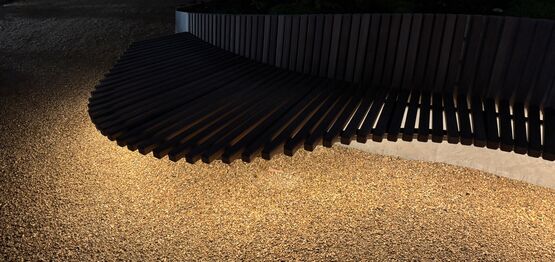
But the most instructive element is how the seating becomes an active co-player after dark. Organic, flowing benches in oiled teak (G9 Landskab, Park og Byrum) tie the green zones together in a rhythm that invites both lingering and movement. And they are subtly lit from below by Okholm Lighting.
It sounds like a small detail — but it changes the behaviour of the entire space:
Benches no longer become black holes in the dark. They become legible, friendly elements.
The light signals “you’re welcome here”. It isn’t floodlight-like; it’s discreet and present — and still decorative.
The furniture gains a double function at night. It works for staying, and as training apparatus — integrated into the overall system.
This is light as invitation — and it genuinely gives the space more identity after dark.
What can architects take away?
Both projects point to a shift: from treating light as a technical layer to using light as a spatial language.
Three design takeaways stand out:
Silhouette beats luminaires.
When light follows a form (the circle at Risbjerggård) or a function (the benches at Orientkaj), the outcome becomes more site-specific than a standard lighting scheme.
Low-level light can deliver higher perceived safety.
It’s not about more lux, but about legibility, contrast control, and avoiding dark blind spots. Under-lighting on elements designed for staying makes the space readable without glare.
When furniture lights up, it communicates use.
An illuminated element for staying is a direct, intuitive signal: you can stop here. It’s wayfinding, programme, and atmosphere in one move.
Light that doesn’t instruct — but suggests.
The strength of both solutions is that they don’t “tell” people what to do. They suggest — discreetly, but clearly. And that is precisely why they work. Light becomes a social and spatial tool that makes architecture more usable — especially in the hours when the city otherwise quiets down.
So the question is not only how we illuminate our public realm.
The question is: What do we want it to say — without words?
Put differently: What should your public space communicate?